Cursive handwriting is the epitome of nostalgia. Many a screed, always repeating time-honored truths forgotten by the hasty modern world, has been written lamenting its demise. “It’s faster, prettier, easier, and flows better.” I used to have really bad handwriting, cursive or otherwise. It got so tiresome that I’ve spent the better part of three years analyzing and working on improving my handwriting, while this past year I’ve finally dove into calligraphy as my art. The progress has come from abandoning all pretenses to cursive and focusing on using engineering/architect letters for anything I want other people to read. Along this path, I’ve wondered to myself why that is so, despite all the conventional wisdom. Studying calligraphy has given me the answer.
First, some cold water for cursivists: no study has ever shown even a slight consistent advantage in speed between print and cursive. Shocking, I know, but not surprising when you think about it. It’s quite a difficult topic to study. How do you control for all the variables? Practice is a big one, and the mother of most of the differences people perceive casually between the two styles. Grandma Mavis who never learned to type and spends all her day writing letters will probably scrawl faster than her grandson Zachary who writes a birthday card maybe once a year. There’s also a standard of fairness to consider: both scripts have to be equally legible in order to count. My mom’s cursive was a legend in our family for just how awful it was to read. I’m pretty sure she could write “faster” than me, though. Does that count? No, but this leads into why cursive isn’t as awesome as its practitioners think. Even if there is some minor speed advantage for cursive in a Platonic pocket dimension somewhere, it doesn’t matter. There’s a reason forms say “print please.” Cursive is inherently less legible than print, and always will be.
All glyphs are bound by rules, but the most crucial is the dance between positive and negative space. The empty space between the script we draw is just as (and often far more) important than the script itself. If you look carefully at the modern scripts we use on our phones and letters, you’ll see this immediately: there’s a lot of empty space that makes the letters pop out. Essentially, letters are tiny pictures your brain has to form into words. Developmental psychology can attest to how children, when first learning to read, approach letters as individual parts as opposed to a greater whole. Overcoming this leads to literacy.
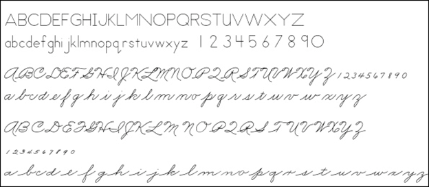
So here we peel back the first myth of cursive, speed. What even is cursive? What’s it trying to do? Hint: it’s not trying to be fast. It never was. Did I just blow your mind? Good. Look carefully at any sample of cursive you can find. What is its goal, its raison d’etre? It’s staring at you in the face: don’t lift the pen. Lift the pen as little as possible. But if glyphs consist of both positive and negative space, how much versus how little you write, how does that even work? Simple: you keep writing, messing with that dance, creating more positive space, much more than would otherwise be necessary, thus encroaching on legibility. This is really obvious when you compare print and cursive exemplars:
Cursive has to do this, because otherwise you have to (gasp) lift the pen, so you have to swerve, back and forth, coming up with clever, awkward, and downright silly alternatives to simply stopping the glyph and moving onto the next. You’re basically inventing new characters, squishing more and more into the same area until it collapses into squiggles. The basic principles of writing demand that cursive slouch towards illegibility no matter how hard the scribe tries to perfect their vaunted penmanship.
Cursivists appeal to the purported advantage of this and the “natural flow” it generates, again likely mistaking practice and mastery for inherent advantage, but it also doesn’t make sense from the standpoint of sheer physics. With cursive, all you’re doing physically is trading vertical distance—lifting the pen up and moving it to the next position—for horizontal distance. Instead of a single, simple stroke for l, you have to cover the same distance twice, plus a little more for the joiner. There is no advantage to be gained in the first place. It’s a wash, through and through, which explains why what few studies there are can’t find any speed advantage at all. In fact, the literature says a combination of print and “cursive” that joins some letters, but definitely not all, is the fastest.
Now, let’s say you’re back in 1985 or something and have to write a 40-page thesis by hand. Cursivists go back to this time that doesn’t exist anymore and talk about how much easier it is to do that, appealing to how people who print get tired easily. Kids, let me give you some life advice: anytime a Very Serious “Adult” cites some magical paradise in the past that neither you nor they can check to see if it was true…they’re lying. There was no magic time when people’s hands didn’t get tired from writing thanks to the mystical flow of cursive. Scribes doodled in the margins a thousand years ago praising God that the sun was going down because they could finally stop writing for the day, and that was slow, methodical work in a quiet monastery. Discomfort and pain involving writing is almost always an issue of technique or management: your grip is too tight, you’re forming letters only with your hand and wrist without employing much shoulder-work, you’re taking too few breaks, etc. Long-form handwriting is damned exhausting no matter what technique you use. As scale increases, you have to make trade-offs, usually through abbreviations, summarizing, etc., so that you have to write less physical material. A crisis in handwriting has little to do with the script and mostly to do with the scribe.
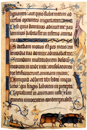
This begs the question: why is cursive trying to lift the pen less? Why is that such a bad thing? In an age where all the fundamental instruments of writing are both superior to and cheaper than what scribes had in the past—the ballpoint pen is one of the greatest achievements of humankind—it’s easy to forget how much of a nightmare the physical act of writing used to be. It’s a long history, full of wonderful twists and turns worth seeking out, but, briefly: in the West, the place we’re discussing, you used quills, while your paper was either awful-but cheap (papyrus) or AMAZING-but-definitely-not-cheap (parchment). Economy of materials was key, not time. Scribes came up with tons of abbreviations to an insane degree just to save paper, which is half the reason why older manuscripts seem like gibberish, because they’re actually written in an ancient form of texting. Yeah, it’s been around for a long time. Here’s a transcript of part of the opening to Titus (i.e., the Holy Bible, the most important book ever) from a random 13th century manuscript:
Paul’ servus di’ apls’ aut’ ihu’ ch’ scdm’ fed’ elector’ di’ & agnitione’ v’itatis q’ sm’ pietate’ e’ i’ spe’ vite et’ne.
Paulus servus dei, apostolius autem ihesu christi secundum fidem electorum dei et agnitionem veritatis quae secundum pietatem est in spem vite eterne.
They weren’t trying to be fast; they were trying to literally not run out of space. In addition, it was advantageous to write at a slight angle to avoid smudging the (meh-quality) ink, which would waste even more paper. Another concern was keeping the writing instrument working. The more you stop, the more opportunity the ink in the nib has to clog, while the more times you put the quill down on paper, pressuring it harder in that initial moment of contact, the more likely the quill would snap, blowing ink across the paper, ruining more materials (potentially an entire page), and costing you additional time in having to reshape a new quill point. This was the impetus to keep the hand flowing with minimal interruptions, not TEMPVS FVGIT. In fact, our predecessors had far more time to work with. Travel was inefficient, as was work. They could take their time and did. Their constraints weren’t your constraints. That’s why cursive came about—and why it’s dying.
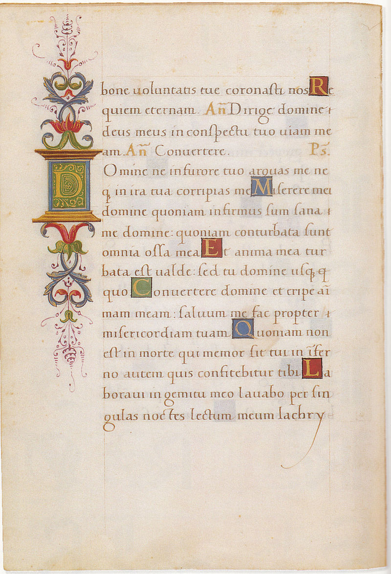
By the way, this all applies to print too. Studying the history of Western writing, you’ll notice two-ish major font styles in illuminated texts before the Renaissance: insular and blackletter. Blackletter descended from insular, and it’s really easy to distinguish from the rest:
Blackletter 
Insular
Blackletter is like cursive print, in that it focuses on one thing to the exclusion of all others, in its case: regularity. It forces you to keep everything straight, angled, narrow, never deviating from its prescribed rules. All letters are strict variants on a basic shape, differentiating glyphs only through what amount to mere flourishes or diacritics. By eliminating the curve and shape variety, it slaughters legibility to create an inimitable aesthetic. When Italian scribes rediscovered “ancient” insular manuscripts from around the turn of the millennium, they were shocked by how legible they were compared to blackletter. Being the subtle bigots they were, they of course ascribed this mastery to the Greeks and Romans they wanted to praise, despite being only a few centuries old. What commentary that survives on writing at the dawn of the Renaissance gripes bitterly about how illegible blackletter. With that spigot opened, Italians and all those they influenced (the Dutch, English, etc.) dropped blackletter like a hot potato. It looks cool but suffers from the same flaws as cursive. All modern type is based on the Humanist scripts that arose in blackletter’s wake, when Italian scribes refocused on legibility and approachability. Just see for yourself:
I keep harping on legibility because that’s the whole point. Writing is meant to be read. An illegible squiggle you write out 0.5 seconds faster is utterly worthless. A squiggle you write 0.2 seconds faster means nothing if you have to spend more than 0.2 seconds reconstructing what it means. Bet you haven’t thought about that, have you? You’re always better off doing something right but slowly once than quickly but sloppily 3-4 times. I changed my handwriting because that’s what kept happening to me. Haste makes waste. As for cursive’s aesthetic appeal, here’s another hard fact: good penmanship looks good, period. Honed handwriting is always beautiful by its very nature, no matter its form. If you care about how it looks, there is always time. If you’re stuck with handwriting for some arcane reason and speed still troubles you, you’re going to get a lot more mileage out of refining your note-taking techniques than your penmanship. Eventually, handwriting will fail you. We invented typing for that reason. Before you start, no, the studies that show handwriting helps aid in retention are really showing that concentrating on information and summarizing it to yourself in the process of absorbing it aids in memory. Which, uh, duh. Handwriting does do that, but so does proper note-taking in general.
If you want good penmanship, you need to want it for its own sake. Otherwise, it doesn’t matter which form you use. In this nascent scribe’s opinion, cursive is a flawed approach to writing because it messes with legibility for the sake of priorities that haven’t mattered in generations. There’s a lot of grace and elegance in cursive forms, but beauty has nothing to do with the science of it. Calligraphy/typography are not the same as writing. Writing is meant to be read. Make the thing legible and sensible. Let God sort the rest out. The cursive-ignorant kids are all right.

Leave a comment